Welcome!
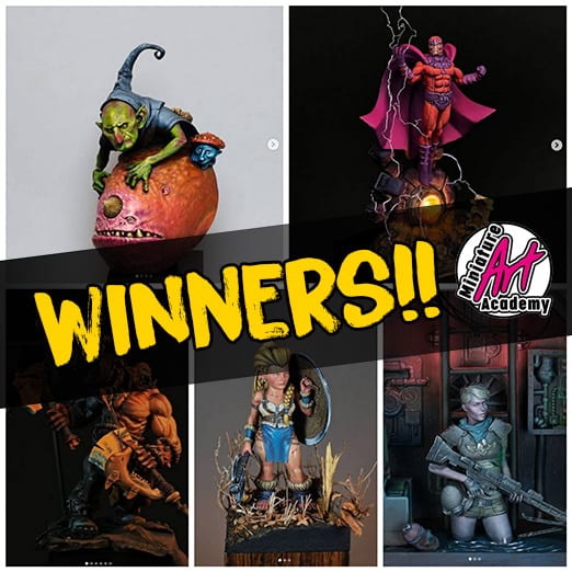
These are the final winers of the fourth weekly contest of march!
To choose the winner of the month we will post the photos on discord and you can vote using the chat, we know the web surveys exist, but we want to make a public vote.
This afternoon we will open a new thread in the discord channel and the winners is going to be decided the 1st of april.
If you are not this month winner, don´t worry, because we are going to make an april contest! if you want to participate, when you post your figures on instagram, use our hashtag and mention us to participate, is easy, right? In a few days we willa nnounce the figures for the winner of the next contest!!
Good luck!
Hola a todos!
Y con esta semana concluyen los participantes del concurso mensual de la academia!
Para hacer la votación utilizaremos el chat de discord. Sabemos que hay webs que lo hacen de maravilla, pero preferímos que el voto sea público y así todo el mundo pueda recontar los votos.
Esta tarde publicaremos en discord en un nuevo canal para que todo el mundo pueda ver los ganadores y tenéis 3 días para votar, el día 1 se contarán los votos y así saldrá el ganador del lote de figuras.
Si vuestra figura no ha resultado la ganadora, no os preocupéis, ya que en abril tenemos nuevo concurso con las mismas reglas, en unos días anunciaremos los premios que obtendrá el ganador del concurso mensual, así que ánimo y a por vuestros pinceles!
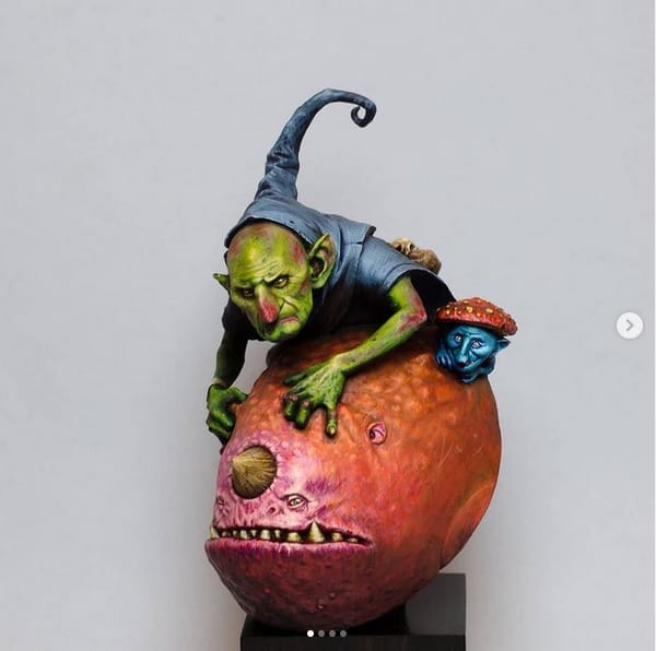
Gold Medal
@danielvillegasgalvez
This figurehave a very intelligent use of color, especially in the grey tones in the shadows and the ambience and the effect is very well resolved.
These types of environmental exercises are very useful to learn to apply colors , although there are quite a few options when it comes to solving it.
If you want to know how this figure have been solved in another way, in the last “Consulting Room” we did on our Twitch channel, we have analyzed this piece and saw different options, you can see it for free in:
https://www.twitch.tv/miniatureartacademy
Is a good use of the material of the academy, for example the process of “The Nun” of David Basilisk.
Esta figura destaca por una utilización del color muy inteligente, sobre todo en grises de valores muy bajos en las sombras y el efecto y la ambientación está muy bien resuelto.
Este tipo de ejercicios ambientales son muy útiles para aprender mejor a usar el color, aunque hay bastantes opciones a la hora de resolverlo.
Si queréis saber como se podría haber resuelto de otra manera, en el último “Consulting Room” que hicimos en nuestro canal de Twitch analizamos esta pieza y vimos diferentes opciones, podéis verlo gratuitamente en:
https://www.twitch.tv/miniatureartacademy
Y sin lugara dudas es un buen uso del material dado en el proceso de David Basilisk hecho en “The Nun”
Silver Medal
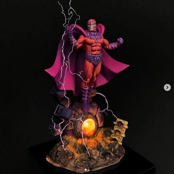
@fher_minis
Without a doubt you have a very loose and nice brushstrokes. The red work is very nice, but maybe something “contained” you could have risked a little more. The volumetric work is good, many times “less is more” and the simplicity that you have used makes the whole work really well. A good color combo with flesh colors in the highlights and purples in the shadows that works great the magentas. The lightning effects work perfectly.
Technically it is fine but what really stands out is the effect you have wanted to achieve and we also want to reward you because something does not need to be extremely complex, you manage to convey the idea that you propose in a clear and well executed way and that for us this week deserves this medal silver.
Sin lugar a dudas tienes una pincelada muy bonita, muy suelta. El trabajo de rojos es muy bonito, pero quizás algo “contenido” te podrías haber arriesgado un poco más. El trabajo en volumetría es bueno, ya que muchas veces “menos es más” y la simplicidad que has utilizado hace que el conjunto funcione realmente bien. Un buen combo de color con colores carne en las luces y morados en las sombras que se conjuntan con los magentas. El efecto de los rayos funcionan perfectamente.
Técnicamente está bien pero realmente lo que destaca es el efecto que has querido conseguir y también queremos premiarte porque no hace falta que algo sea extremandamente complejo, consigues transmitir la idea que propone de forma clara y bien ejecutada y eso para nosotros esta semana merece esta medalla de plata.
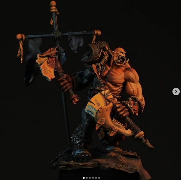
Bronze medal
@mini_pauer
@kike_beroller
And this week in the bronze position we have a tie! There are 2 figures that this week deserve the bronze medal.
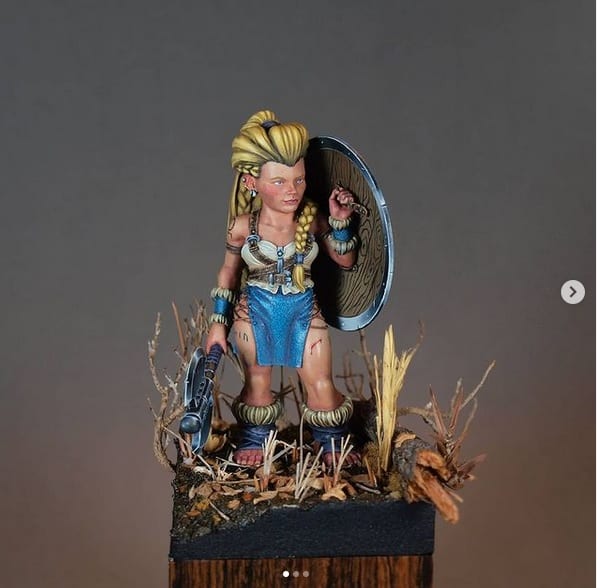
On the one hand we have a figure of Spira mirabilis painted by @mini_pauer. Perhaps it penalizes a little to have seen the same scheme in other versions of other painters, the piece in general is very good but when you paint black clothes you have to be careful because you run the risk of ending up looking more grayish than black. Undoubtedly a good job of textures, good brushstrokes, some very interesting transitions in the red areas. The pinkish area of the squig could be pretty much delineate and it would have to look more natural and a little less thought out. A great job with a very good visual aspect.
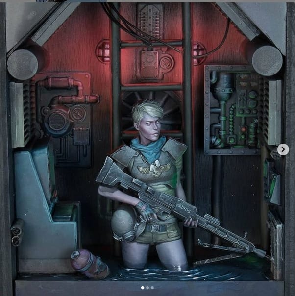
And on the other, this miniature from Nocturna Models with a small background painted by @kike_beroller, a more ambitious project that aspired to a bigger prize. The idea and the atmosphere is well achieved but it lacks a better work in the shadow areas since the piece has a very similar luminosity value in general, areas of greater shadow would help a lot to give depth, perhaps helping you with inks mixed with blue or green or by making the box deeper. When you make box dioramas, all the details have to help you immerse yourself in the environment and that the grain of the wood can be seen can take away the industrial feel that the piece should give you. The lighting effects are managed to highlight the paint job on the skin, the cast shadows work very well. Overall it is a great piece.
Y esta semana en el puesto del bronce tenemos un empate! Hay 2 figuras que esta semana se merecen la medalla de bronce.
Por un lado tenemos una figura de Spira mirabilis pintada por @mini_pauer. Quizás penaliza un poco el haber visto el mismo esquema en otras versiones de otros pintores, la pieza en general está muy bien pero cuando se trabaja con ropajes de color negro hay que tener cuidado ya que corres el riesgo de acabar pareciendo más un grisaceo. Sin lugar a dudas un buen trabajo de texturas, buena pincelada, unas transiciones en las zonas rojas muy interesantes, aunque hay que tener cuidado cuando se pintan superficies orgánicas de que los tonos se fundan más, ya que por ejemplo la zona más rosácea se podría prácticamente delimitar y tendría que parecer más natural y un poco menos pensado. Un gran trabajo con un muy buen aspecto visual.
Y por otro esta miniatura de Nocturna Models con un pequeño background que está pintada por @kike_beroller un proyecto más ambicioso que aspiraba a un mayor premio. La idea y el ambiente está bien conseguido pero le falta trabajo en las zonas de sombra ya que la pieza tiene un valor de luminosidad muy similar en general, zonas de mayor sombra ayudarían mucho a dar profundidad, quizás ayudándote de tintas mezcladas con azul o verde o haciendo que la caja tuviese más profundidad. Cuando haces dioramas de caja todos los detalles tienen que ayudarte a sumergirte en el ambiente y que se vea la veta de la madera puede quitarte un poco la sensación industrial que debe dar la pieza. Los efectos de iluminación están conseguidos a destacar el trabajo de pintura en la piel, las sombras casteadas fuincionan muy bien. En general es una pieza atractiva visualmente
Finalistas y menciones especiales
@6qminiatures
It is a very beautiful figure with a good technical work, the selection of colors is good but it lacks a bit of contrast in the shadows, we do not know if the satin effect on the skin has been done on purpose, which can be a valid aesthetic decision since for example it makes the legs appear more in “shape”.
Es una figura muy bonita con un buen trabajo técnico, la selección de colores es buena pero se le echa en falta un poco de contraste en sombras, no sabemos si se ha satinado a propósito la piel, que puede ser una decisión estética válica ya que por ejemplo hace que las piernas parezcan más “torneadas”.


3 Responses
Excelentes trabajos! Felicidades a todos los finalistas!
muchisimas gracias por todas las iniciativas que estáis haciendo, y también por las correcciones, gracias a vosotros la comunidad sigue creciendo!!
Gracias a ti por pasarte y mostrar tu apoyo!