Welcome!
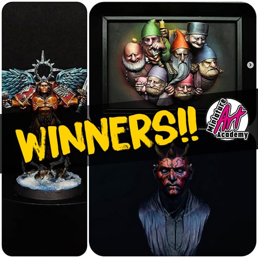
Today we want to share with you the winners of the first week of May.
This is the first week of the monthly contest and this is the only the begining, we are going to choose winners all the weeks until the end of the month and then you will decide the monthly winner in our discord channel, and yes, you have readed well, YOU are going to decide it!
And the next week we are going to unveil the prizes for the winner
Good luck!
Hola a todos!
Y hoy os queremos presentar a los ganadores de la primera semana de Mayo! Esto abre oficialmente el concurso de Mayo y como casi todos sabréis, esto significa que escogeremos ganadores semanalmente y que al final seréis vosotros los que elijáis al ganador en nuestro canal de discord
Esta semana concluye el mes de abril y empezamos con las votaciones para saber quien sera el ganador/ganadora del concurso de Abril, si queréis votar en bien sencillo, solo tenéis que acudir a nuestro canal de discord y una vez allí encontraréis las fotos y como votarlas. La votación se cerrará el lunes que viene, así que tenéis toda la semana para decidir quien se llevará los premios (para los que no se acuerden los dejo al final del artículo).
Avisamos de que este mes tenemos premios jugosos que anunciaremos la semana que viene… aunque es posible que haga un spoiler este viernes en Twitch durante “La Cueva del Troll”
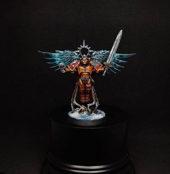
Gold Medal

@paloji83
And we start this week with Dwarves like April! This time the gold medal has gone to Paloji. This set of dwarfs has a very interesting setting, of their latest works it is undoubtedly the one that has most attracted our attention, since it has very good contrasts with those shades so “charcoal” or blackish and a very interesting chiaroscuro point and each dwarf has a very good point of light. With such a gloomy game of contrasts, I would have chosen colors with darker values for some hats to enhance the effect of the candles. Perhaps it is true that some general focus is missing, since each one having a different focus can be a bit confusing, an example is the dwarf on the left, the bold one, which has a very large light, but this piece is quite difficult in that aspect, since keeping so many characters with so much personality together is a very difficult task that you have solved very well. The choice of colors on the back of the base has turned out to be a success and the set is a beautiful figure, congratulations!
Y esta semana empezamos como acabamos la última de Abril, con Enanos! En esta ocasión la medalla de oro se ha ido para Paloji. Este conjunto de enanos tiene una ambientación muy interesante, de sus últimos trabajos es sin duda el que más ha llamado nuestra atención, ya que tiene unos contrastes muy buenos con esas sombras tan “carbón” o negruzcas y un punto de claroscuro muy interesante y cada enano tiene un punto de luz muy acertado. Con un juego de contrastes tan tenebrista yo habría elegido para algunos gorros colores con valores mas oscuros para potenciar el efecto de las velas. Quizás es cierto que falte algo de foco general, ya que al tener cada uno un foco diferente puede confundir un poco, un ejemplo es el enano de la izquierda, el calvete, que tiene un foco de luz muy amplo que por ejemplo yo hubiese recortado, pero esta pieza es bastante difícil en ese aspecto, ya que mantener tantos personajes con tanta personalidad juntos es una tarea muy difícil que has resuelto muy bien. La elección de colores en la parte de atrás de la base ha resultado ser un acierto y el conjunto es una figura preciosa, enhorabuena!
Silver Medal
@Nuviraminiatures
A very good and interesting conversion job, I think it fits perfectly the sculpt, it seems that the figure has been designed to do such a conversion. It’s a very understated paint job, it works well and it’s classy, but maybe it’s lacking a bit of risk, the idea is good and you could have taken it further. For example, the tunic has purple tones that you could have contrasted more, it is also true that the photo marks a light there that I do not know if it is painted or an effect of the photograph. You could have brought the light to the shoulder area to cut out the silhouette or put a point of light frontalized to the face a little more powerful, since there you have some very beautiful tones between cold and warm reds and that area would be more interesting to pictorial level. The piece is pretty and it works and the conversion idea is great.
Un trabajo muy bueno e interesante de conversión, pienso que encaja a la perfección, parece que la figura haya sido diseñada para que se haga una conversión así. Es un trabajo de pintura muy sobrio, funciona bien y es elegante, pero quizás le falte un poco de riesgo, la idea es buena y podrías haberla llevado más allá. Por ejemplo la túnica tiene unas tonalidades amoratadas que podrías haber contrastado más, también es cierto que la foto marca una luz ahí que no se si es pintada o un efecto de la fotografía. Podrías haber llevado la luz a la zona de los hombros para recortar la silueta o meter un punto de luz frontalizado a la cara un poco más potente, ya que ahí tienes unos tonos muy bonitos entre rojos frios y calidos y esa zona sería más interesante a nivel pictórico. La pieza es bonita y funciona y la idea de conversión es genial.
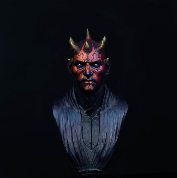
Bronze Medal
@vallejominiatures
A very beautiful figure but remember to publish larger photos when you submit figures to a contest, since there are times when we cannot appreciate your work well. It is a very nice paint job and I praise your ability to make this kind of work in this scale, as it is not a simple job and less with a convincing non-metallic. Perhaps the gold is a bit too yellowish (although a real gold ingot is really like that) but in such a small figure it makes it look a bit “cartoonish” or exaggerated, since it also combines with the contrast of the wings that are bluish and form a complementary contrast. The non-metallic are fine but they allow a little more “refinement” which is not the same as “glazed” which is just one way to achieve it, but it can also be achieved by texture with stippling or different brush strokes to make the transition between reflections a little more defined
Una figura muy bonita pero recordad publicar fotos más grandes para cuando presenteis figuras a un concurso, ya que hay veces que no podemos apreciar bien vuestro trabajo. Es un trabajo de pintura muy bonito y alabo tu capacidad de destacar una figura de esta escala, ya que no es un trabajo sencillo y menos con un no metálico convincente. Quizás el oro es un poco demasiado amarillento (aunque un lingote de oro real es realmente así) pero en una figura tan pequeña hace que quede un poco “cartoon” o exagerado, ya que además se junta con el contraste de las alas que son azuladas y forman un contraste por complementarios. Los no metálicos están muy bien pero admiten un poco más de “refinamiento” que no es lo mismo que “fundido” que es solo una manera de conseguirlo, pero también se puede conseguir mediante textura con punteados o diferentes trazadas de pincel para hecer la transición entre los reflejos un poco más definida
Y hasta aquí el concurso de esta semana!!


No responses yet